HP Touchpoint Manager 2.0
The upgrade that never came to beDashboard Redesign
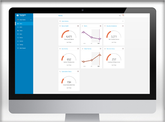
Here is the newly redesigned Dashboard with editable widgets that allow the user to see the status of his company at a glance.
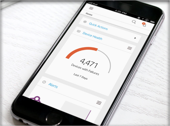
Responsive design allows the user to manage their organization’s assets on the go, on any device.
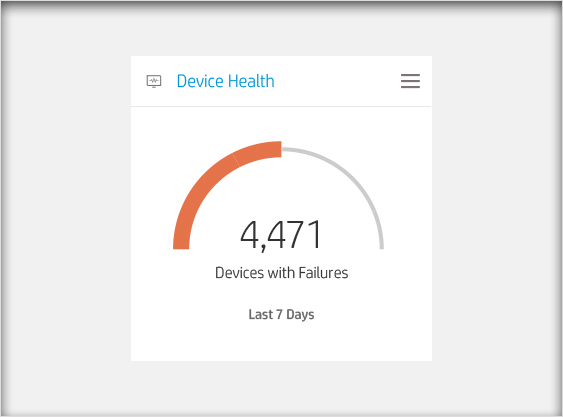
Closeup of a dashboard widget. Only 1 data set is shown. In this case, only the “sad” information — which shows the user only what they need in order to take action.
Touchpoint Manager: Cloud-Based IT Management
![]() HP, Inc saw the need for small to medium businesses to have the ability to manage their IT assets in the cloud. Thus HP Touchpoint Manager was born. I was part of a small, but elite, team of visual designers, interaction designers, front-end developers, and UX Architects.
HP, Inc saw the need for small to medium businesses to have the ability to manage their IT assets in the cloud. Thus HP Touchpoint Manager was born. I was part of a small, but elite, team of visual designers, interaction designers, front-end developers, and UX Architects.
For the first year on this project, my role was that of a simple visual designer. I had designed our product’s logo, and was a stickler for the details of our components. But I was soon tasked with embracing the non-visual side of user experience design. For two additional years my focus was directed at the interaction design of our product.
Interaction Design
After helping support the creation of our design component library, we quickly built several screens and planned UX flows. Over a series of months, the team iterated several hypotheses about how to solve each problem with which we encountered. We brought our designs through many rounds of usability and user-testing. We received feedback from our partners in the field who were using our software.
Taking all of that data, I began rethinking how we approached the 3 main components of our product: The dashboard, the “List of Things” layout, and the details layout. What we called “The List of Things” simply referred to a page that showed a list of devices (desktop computers, laptops, mobile phones, tablets, etc.).
Dashboard Widgets
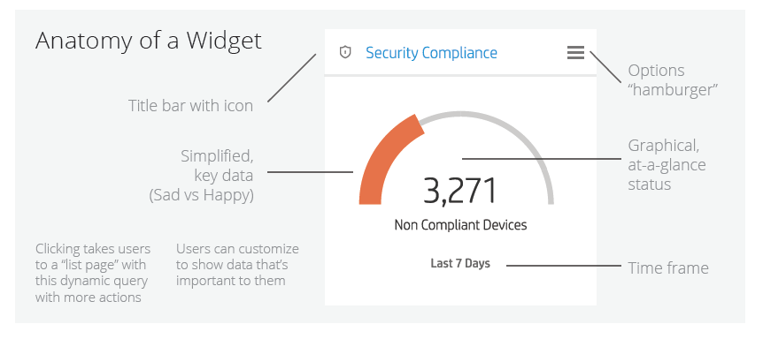
After several months of pouring over the whiteboards, piles of sticky notes, and wire-frame printouts, I began to put together several new ideas. Our dashboard needed to display information that was fully customized (tailored to the user’s needs), actionable and conveyed complex information quickly in bite-sized chunks.
Check out the PDF of Dashboard Widget principles here.
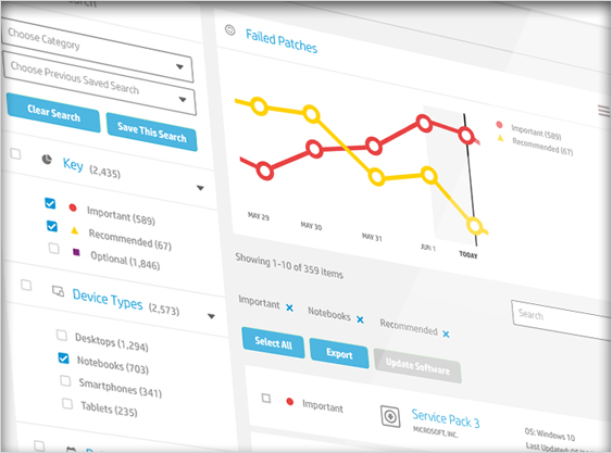
Re-imagined List Pages with New Filtering & Search Tools
We worked through many iterations of this page layout. Each time we felt we nailed the interaction on the page, the results would come back from our tests with users and we’d need to start again. After several rounds of user-testing, we discovered that the interaction was divided and flowed unnaturally on the page. A dominating graph sat on the upper left of the screen, while the search results was placed to the right of the graph–just under the tags. UNDER the graph were the actual search filters–what our users were truly clicking. They were underneath everything!
See the PDF of how we solved this problem with wire-frames!
Design Methods Used
- Human-Centered Design
- Lean UX
- Research
- Customer Interviews
- User Testing
- Concept Workshops
- White-boarding
- Wire-frames
Guiding Principles
- Simplified key information
- Visual, at-a-glance recognition
- Flexible, yet consistent
- Customizable
- Actionable